Result Analysis with Jupyter Notebooks
Note
This page was generated from maestro_output_analysis.ipynb. To interact with this Jupyter Notebook, launch the binder below and open tools/jupyter_notebook/maestro_output_analysis.ipynb.
MAESTRO
An Open-source Infrastructure for Modeling Dataflows within Deep Learning Accelerators (https://github.com/maestro-project/maestro)
The throughput and energy efficiency of a dataflow changes dramatically depending on both the DNN topology (i.e., layer shapes and sizes), and accelerator hardware resources (buffer size, and network-on-chip (NoC) bandwidth). This demonstrates the importance of dataflow as a first-order consideration for deep learning accelerator ASICs, both at design-time when hardware resources (buffers and interconnects) are being allocated on-chip, and compile-time when different layers need to be optimally mapped for high utilization and energy-efficiency.
MAESTRO Result Analysis
This script is written to analyze the detailed output of MAESTRO per layer using various graphing techniques to showcase interesting results and filter out important results from the gigantic output file that the tool dumps emphasising the importance of Hardware Requirements and Dataflow used per layer for a DNN Model.
1 - Packages
Let’s first import all the packages that you will need during this assignment. - numpy is the fundamental package for scientific computing with Python. - matplotlib is a library to plot graphs in Python. - pandas is a fast, powerful and easy to use open source data analysis and manipulation tool
%matplotlib inline
import numpy as np
import pandas as pd
import matplotlib.pyplot as plt
from graph_util import *
2 - Reading the output file
Please provide the output file for your Maestro run to be read by the script with the path relative to the script.
pd.read_csv(“name of your csv file”)
As an example we are reading file in tools/jupyter_notebook/data folder including data/Resnet50_kcp_ws.csv
resnet50_kcp_ws_pe256_data = pd.read_csv('data/Resnet50_kcp_ws_pe256.csv')
resnet50_rs_pe256_data = pd.read_csv('data/Resnet50_rs_pe256.csv')
mobilenetv2_kcp_ws_pe256_data = pd.read_csv('data/MobileNetV2_kcp_ws_pe256.csv')

resnet50_kcp_ws_pe1024_data = pd.read_csv('data/Resnet50_kcp_ws_pe1024.csv')
2 - Creating Graphs
Graphs can be generated by assigning values to the variables provided below in the code.
The graphs are created by draw_graph function which operates on the variables provided below.
3- Understanding the Variables
x = “x axis of your graph”
One can simply assign the column name from the csv to this graph as shown below in the code. Also, an alternate way is to select the column number from dataframe.columns. For example: for this case it will be new_data.columns[1] that corresponds to ‘Layer Number’.
y = “y axis of your graph”
One can simply assign the column name from the csv to this graph as shown below in the code. Also, an alternate way is to select the column number from dataframe.columns. For example: for this case it will be new_data.columns[5] that corresponds to ‘Throughput (MACs/Cycle)’.
User can compare multiple bar graphs by providing a list to y.
color = “color of the graph”
figsize = “Controls the size of the graph”
Legend =” Do you want a legend or not” -> values (True/False)
title = “title of your graph”
xlabel = “xlabel name on the graph”
ylabel = “ylabel name on the graph”
start_layer = “start layer that you want to analyse”
a subset of layers to be plotted which are of interest. This variable allows you to do that.
end_layer =“last layer that you want to analyse”
a subset of layers to be plotted which are of interest. This variable allows you to do that. Please provide “all” if you want all the layers to be seen in the graph
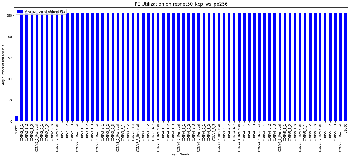
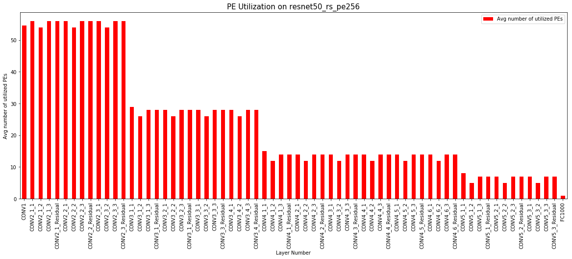
# Compare two different dataflow on the same DNN and HW

x = 'Layer Number'
y = 'Avg number of utilized PEs'
color = 'blue'
figsize = (20,7)
legend = 'true'
title = 'PE Utilization on resnet50_kcp_ws_pe256'
xlabel = x
ylabel = y
start_layer = 0
end_layer = 'all'
draw_graph(resnet50_kcp_ws_pe256_data, y, x, color, figsize, legend, title, xlabel, ylabel, start_layer, end_layer)

x = 'Layer Number'
y = 'Avg number of utilized PEs'
color = 'red'
figsize = (20,7)
legend = 'true'
title = 'PE Utilization on resnet50_rs_pe256'
xlabel = x
ylabel = y
start_layer = 0
end_layer = 'all'
draw_graph(resnet50_rs_pe256_data, y, x, color, figsize, legend, title, xlabel, ylabel, start_layer, end_layer)

#draw_two_graph(resnet50_kcp_ws_data, resnet50_rs_data, y, x, color, figsize, legend, title, xlabel, ylabel, start_layer, end_layer)
<matplotlib.axes._subplots.AxesSubplot at 0x123605450>
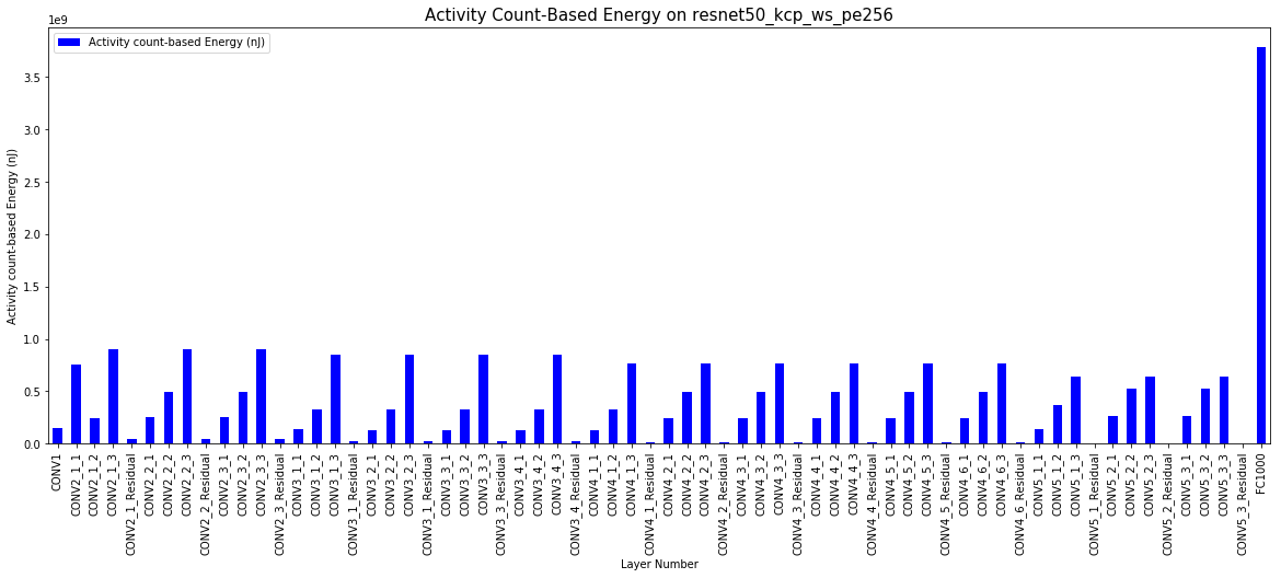
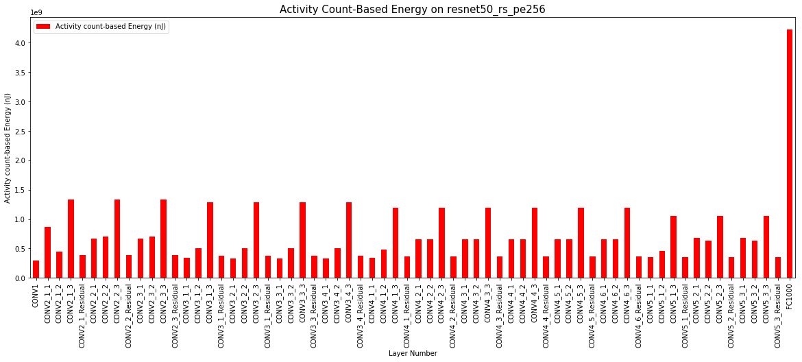
# Compare two different dataflow on same DNN and HW

x = 'Layer Number'
y = 'Activity count-based Energy (nJ)'
color = 'blue'
figsize = (20,7)
legend = 'true'
title = 'Activity Count-Based Energy on resnet50_kcp_ws_pe256'
xlabel = x
ylabel = y
start_layer = 0
end_layer = 'all'
draw_graph(resnet50_kcp_ws_pe256_data, y, x, color, figsize, legend, title, xlabel, ylabel, start_layer, end_layer)

x = 'Layer Number'
y = 'Activity count-based Energy (nJ)'
color = 'red'
figsize = (20,7)
legend = 'true'
title = 'Activity Count-Based Energy on resnet50_rs_pe256'
xlabel = x
ylabel = y
start_layer = 0
end_layer = 'all'
draw_graph(resnet50_rs_pe256_data, y, x, color, figsize, legend, title, xlabel, ylabel, start_layer, end_layer)
<matplotlib.axes._subplots.AxesSubplot at 0x111beea50>
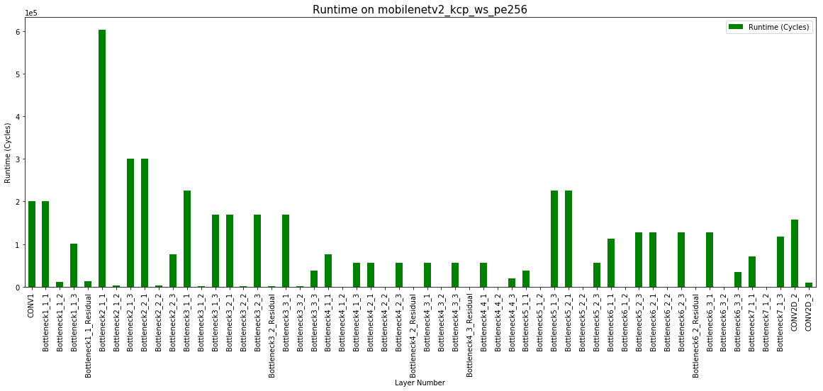
# Compare two different DNNs with same dataflow and HW

x = 'Layer Number'
y = 'Runtime (Cycles)'
color = 'blue'
figsize = (20,7)
legend = 'true'
title = 'Runtime on resnet50_kcp_ws_pe256'
xlabel = x
ylabel = y
start_layer = 0
end_layer = 'all'
draw_graph(resnet50_kcp_ws_pe256_data, y, x, color, figsize, legend, title, xlabel, ylabel, start_layer, end_layer)

x = 'Layer Number'
y = 'Runtime (Cycles)'
color = 'green'
figsize = (20,7)
legend = 'true'
title = 'Runtime on mobilenetv2_kcp_ws_pe256'
xlabel = x
ylabel = y
start_layer = 0
end_layer = 'all'
draw_graph(mobilenetv2_kcp_ws_pe256_data, y, x, color, figsize, legend, title, xlabel, ylabel, start_layer, end_layer)
<matplotlib.axes._subplots.AxesSubplot at 0x12456d4d0>

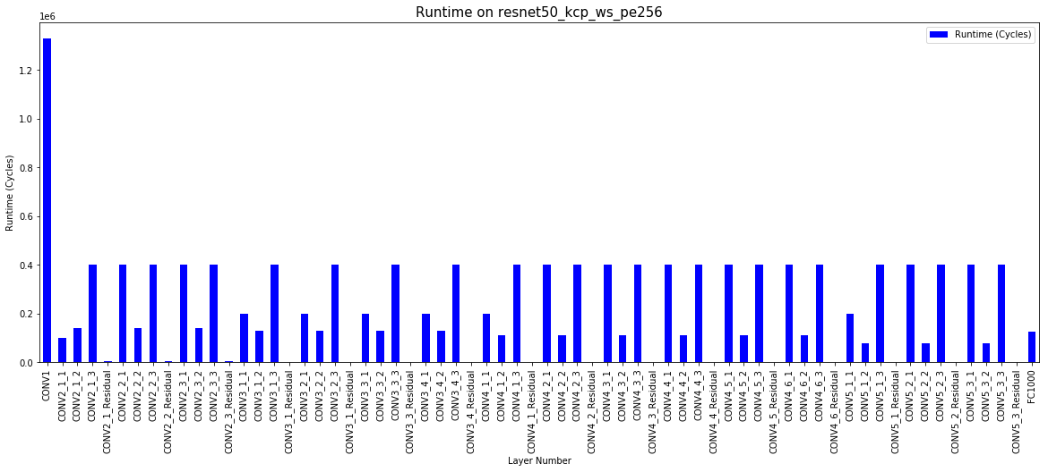
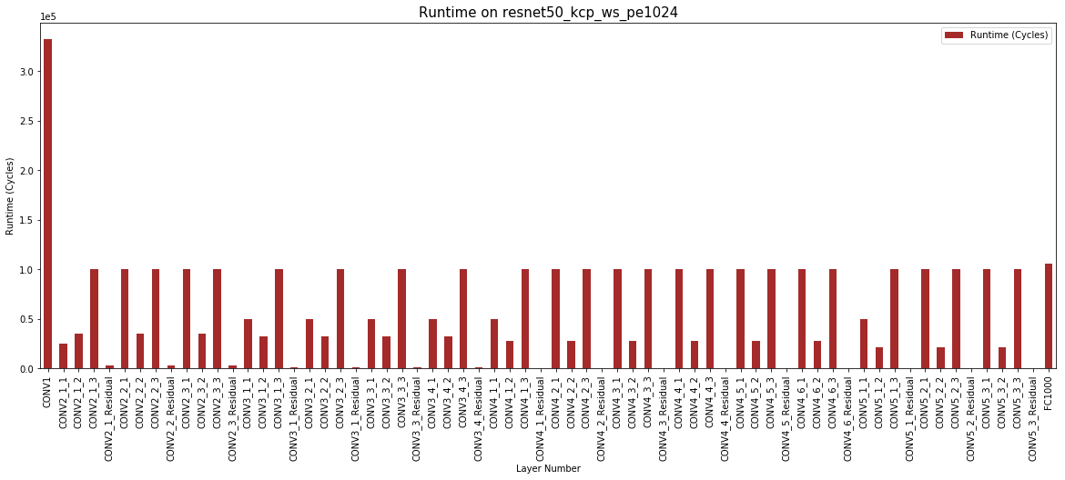
# Compare two different HWs with same dataflow and DNN

x = 'Layer Number'
y = 'Runtime (Cycles)'
color = 'blue'
figsize = (20,7)
legend = 'true'
title = 'Runtime on resnet50_kcp_ws_pe256'
xlabel = x
ylabel = y
start_layer = 0
end_layer = 'all'
draw_graph(resnet50_kcp_ws_pe256_data, y, x, color, figsize, legend, title, xlabel, ylabel, start_layer, end_layer)

x = 'Layer Number'
y = 'Runtime (Cycles)'
color = 'brown'
figsize = (20,7)
legend = 'true'
title = 'Runtime on resnet50_kcp_ws_pe1024'
xlabel = x
ylabel = y
start_layer = 0
end_layer = 'all'
draw_graph(resnet50_kcp_ws_pe1024_data, y, x, color, figsize, legend, title, xlabel, ylabel, start_layer, end_layer)
<matplotlib.axes._subplots.AxesSubplot at 0x124d43d50>